This is another post in the series that was not planned for.
It shows the automation of an App [1] build, upload to a local repository and deployment to a ‘k3s Kubernetes cluster’ [2]. The last stage, the deployment mechanism to a Kubernetes cluster differs from the GitLab recommended approach. No agent, helm or special charts that GitLabs provides to deploy to Kubernetes is implemented. The deployment is done with a ‘hack’ as several post on forums suggest. But as it doesn’t scale, an article using the agent should be posted here ‘soon’.
> Notes: > > [1] The app is a PHP/Angular/Bootstrap frontend and Redis enabled replication database. > > [2] You can check the cluster set up steps in a previous post: k3s Raspberry Pi Kubernetes Cluster.
I. GitHub Project Set Up
We will create a project and declare some variables used in our ‘gitlab-ci’ pipeline.
Step 1.1. Make the repository public
- Access the GitLab Server. I have shown examples using your local instance:
http://example.gitlab.com.
I log in as devguy/Clave123 (use your credentials, annotate them as some files will use them). - Create a project
Click ‘New project’ button. Select ‘Create blank project’
I’m naming this one: guestbook
With public access. No need for a Readme.
Create it.
Step 1.2. Add variables
We will use a few CI/CD variables to share our credentials with the docker runner (also created previously) so it can SSH into our machines. To create them:
- Access our GitLab Server
- Go to **Project ** > gestbook
then Settings > CI/CD - Scroll to the Variables section and click the Expand button
- Fill the data (see below for each of them) and click ‘Add Variable’ button.
The variables used in our gitlab-ci.yaml hold values we already know from our project or can get from a console terminal in your controlling PC:
1 Create user credentials variables for the Gitlab project (replace your values):
- Key:
USERNAME
Value:devguy
Type:Variable
Environment scope:All (default)
Protect variable:Checked
Mask variable:Unchecked - key:
USERPASSWORD
value:Clave123
Type:Variable
Environment scope:All
Protect:uncheck
Mask:uncheck
2 Create a variable for your PC user that Ansible will use to SSH log in
- key:
SERVER_USERvalue:fjmartinez<- The user who runs ansible in your PC
Type:Variable
Environment scope:All
Protect:uncheck
Mask:uncheck - key:
SERVER_IP
value:192.168.1.120<- You can use theifconfigcommand
Type:Variable
Environment scope:All
Protect:uncheck
Mask:uncheck
3 For the SSH login of the docker runner into the Kubernetes nodes (Raspeberry Pi)
You are going to store the PC SSH private key in a GitLab CI/CD variable. To get the SSH private key use:
$ cat ~/.ssh/id_rsaCopy the complete output to your clipboard:
-----BEGIN RSA PRIVATE KEY-----
...
-----END RSA PRIVATE KEY------ Key:
SSH_PRIVATE_KEY
Value: Paste your SSH private key from your clipboard (including a line break at the end).
Environment Scope:All
Type:Variable-> If you use ‘File’ its easier to pass it to a container but I don’t need that for this example.
Protect variable:Unchecked
Mask variable:Uncheck
The next one is a big string as it is the values of the machines you have ssh into:
- Key:
SSH_KNOWN_HOSTS
Value: copy the output of (IP from PC and two raspberry’s):
  $ ssh-keyscan 192.168.1.120 192.168.1.223 192.168.1.224
  <<output>>
Type: Variable
Environment Scope: All
Protect variable: Unchecked
Mask variable: Uncheck
II. Get the code
The code in this post is borrowed from Google Cloud’s tutorial “Create a guestbook with Redis and PHP“. I don’t use their images as they are amd64. I need to create new ones that can run in a Raspberry Pi Kubernetes Cluster (arm64 processor architecture).
My files are here. Then use the following statements:
Step 2.1 Set the local repository
# Use your local path
$ mkdir ~/Desarrollo/ci_cd/Ansible/107_Redis_CICD

# untar/gzip it
$ curl

# Get into the code folder (use your path to 'guestbook')
$ cd ~/Desarrollo/ci_cd/Ansible/107_Redis_CICD/guestbook
Step 2.2 Initialize the folder as repository with the proper branch
Initialize it as a git repository
$ git init
$ git add .
In Ubuntu 20.10 (December 2021) I get a ‘master’ branch from git initialization. I rename it to ‘main’:
# Check the brach name
$ git branch -a
* master

# If no branch is listed, create it with a commit, that is normal. If master is listed then skup this command
$ git commit -a -m "GitLab CI CD & k3s pre branch"

# If master exist, rename it as main
$ git branch -m master main

# Chech the name again and the status
$ git branch --list
* main

$ git status On branch
On branch main
nothing to commit, working tree clean
Set the remote GitLab repository credentials. I write my URL (from step 2.1 with the user and password), with ‘devguy’ and ‘devguy@gitlab.example.com‘ (replace your values)
$ git remote add origin http://devguy:Clave123@gitlab.example.com/devguy/guestbook.git
$ git config --global user.name "devguy"
$ git config --global user.email "devguy@gitlab.example.com"
Step 2.3 Modify the Kubernetes files
The ‘image’ in ./files/frontend.yaml and ./files/redis-follower.yaml will need to be updated to the project repository name. And also the path to your controlling machine ‘kubeconfig’ in ./files/guestbook_deployment_playbook.yaml.
Step 2.4 Modify the GitLab pipeline
Check the following overview of the pipeline to see what lines you need to modify as you set your own path names and variables.
III. Bulidx
We need ‘arm64’ images for our Raspberry Pi and ‘amd64’ images for our 386/intel/amd machines. To enable docker to build multiplatform images we need to use the ‘experimental’ feature docker buildx to extend the docker build command with the support provided by Moby BuildKit builder toolkit. BuildKit is designed to work well for building for multiple platforms and not only for the architecture and operating system that the user invoking the build happens to run.
In the script we also use buildx lsto list all available builders and docker buildx create command with the parameter --use so the builder is set with the current builder instance pointing to a docker context or endpoint, where context is the name of a context from docker context ls (by default, the current Docker configuration is used for determining the context/endpoint value). You can build it or copy a binary. I show the first one in the script.
When you use this image in docker run or docker service, Docker picks the correct image based on the node’s platform. Or you can set the --platform flag to specify the target platform for the build output, (for example, linux/amd64, linux/arm64, or darwin/amd64).
IV. Code overview
In this gitlab-ci.yml script we can see that three stages will be used. And that the top three variables are the ones we use for the ‘docker runner’ to connect and use the correct filesystem and also to push to our http ‘ssh-less’ repository. The last two ar for the platform that the docker images will be available and the local registry our project is using (update the las one if you use a different project name):
stages:
  - buildx
  - package
  - test

variables:
  DOCKER_HOST: tcp://docker:2375/
  DOCKER_DRIVER: overlay2
  DOCKER_TLS_CERTDIR: ""
  # Docker platforms to build
  TARGETPLATFORM: 'linux/amd64,linux/arm64'
  REGISTRY_IMAGE: 'registry.example.com:5050/devguy/guestbook/follower'
In the ‘buildx’ stage the runner is instructed to use initially an image that contains ‘git’ so we can clone the ‘buildx’ git repository. Then an image will be build and stored as an artifact. For that build we need the ‘services’ provided by a docker daemon (that can run in docker – dind).
buildx:
  image: docker:20.10-git
  stage: buildx
  variables:
    GIT_STRATEGY: none
  artifacts:
    paths:
      - buildx
    expire_in: 1 hour
  services:
    - docker:20.10-dind
  script:
    - 'git clone git://github.com/docker/buildx ./docker-buildx'
    - 'DOCKER_BUILDKIT=1 docker build --platform=local -o . ./docker-buildx'
The ‘packager’ stage will build the multiplatform images. I use docker 20.10 (the recommended minimum for buildx is 19.03) for the runner image as for the dind service:
package_follower:
  stage: package
  image: docker:20.10
  services:
    - docker:dind
    - name: docker:dind
      command: ["--experimental"]
In ‘before_script’ we set another environmental variable to enable experimental features, copy our buildx artifact to a new folder (cli-pluins), create a new builder instance and set it as the current one. Run the multiarch/qemu-user-static docker image to emulate ARM64 environment to build that platform. And log into our local GitLab project’s container repository using the server variables previously defined in the GitLab project.
before_script:
    # buildx-artifact setup
    - export DOCKER_CLI_EXPERIMENTAL=enabled
    - mkdir -p ~/.docker/cli-plugins
    - mv buildx ~/.docker/cli-plugins/docker-buildx
    - docker buildx create --driver-opt network=host --config buildkit-config.toml --use
    # Start arm emulator
    - docker run --rm --privileged multiarch/qemu-user-static --reset -p yes
    # repository login
    - 'echo $USERPASSWORD | docker login registry.example.com:5050 -u $USERNAME --password-stdin'
As a ‘script’ we create two (Follower and Frontend) images indicating the tag to be used and in the same command push it into our local repository. Notice that I use ‘variable substitution’ with or without “{}” as is helps the parser when concatenation with other text might confuse it.
There are two folders in the example. One for the ‘Follower’ that contains the Dockerfile and the Shell command to start Redis as a ‘–replicaof’ (the leader). The replicas will automatically reconnect to the master every time the link breaks, and will attempt to be an exact copy of it regardless of what happens to the master.
Note: This is a modification made to the original code: “Starting with Redis version 5, the Redis project no longer uses the word slave. Please use the new command REPLICAOF. The command SLAVEOF will continue to work for backward compatibility”. In the run.sh the following change was made:
# Old code
redis-server --slaveof ${REDIS_LEADER_SERVICE_HOST} 6379
# New code:
redis-server --replicaof ${REDIS_LEADER_SERVICE_HOST} 6379
The second folder is the ‘Frontend’ that contains the PHP app with an HTML page, controller, composer (manages dependencies), php code to write to the database plus the Dockerfile. It is a HTML-PHP front end configured to communicate with either the Redis follower or leader Services, depending on whether the request is a read or a write. The frontend exposes a JSON interface, and serves a jQuery-Ajax-based UX.
script:
    - 'docker buildx build --push --platform $TARGETPLATFORM --tag ${REGISTRY_IMAGE}follower:multiarch follower'
    - 'docker buildx build --push --platform $TARGETPLATFORM --tag ${REGISTRY_IMAGE}frontend:multiarch frontend'
In the ‘deploy’ stage we first provide the SSH login data that the Ansible container needs in our ‘Docker runner’ to access the Ansible files in the developer machine to make the App deployment.
Note: We could have also copied the credentials of the pi’s, the kubeconfig file, use an ansible image that has the openshift, request and kubernetes python modules that are need to deploy a Kubernetes scrit and end up with cleaner code, but seems a lot of work that we can avoid 🙂
cluster:
  stage: deploy
  before_script:
    - 'which ssh-agent || ( apt-get update -y && apt-get install openssh-client git -y )'
    - eval $(ssh-agent -s)
    - echo "$SSH_PRIVATE_KEY" | tr -d '\r' | ssh-add -
    - mkdir -p ~/.ssh
    - chmod 700 ~/.ssh
    - echo "$SSH_KNOWN_HOSTS" >> ~/.ssh/known_hosts
    - chmod 644 ~/.ssh/known_hosts
The script last stage will execute the ‘guestbook_deployment_playbook.yaml’ as a ssh command in the developers machine. In it we set the folder where the files are located and the path so ansible-playbook executable is located
  script:
    - ssh $SERVER_USER@$SERVER_IP
      'export PATH="$HOME/.local/bin:$PATH";
      cd ~/Desarrollo/ci_cd/Ansible/107_Redis_CICD/guestbook;
      ansible-playbook
      --connection=local
      -i localhost,
      ./files/guestbook_deployment_playbook.yaml'
That playbook will run using ‘localhost,’ (notice the comma, that makes the inventory a list more than a file that we have used before). We dont need the Raspberry’s inventory for the Kubernetes deployment. Each one of the three kubernetes deployments will contain a pod and its service definition:
- ./files/redis-leader-deployment.yaml First a namespace (testing) is created as it is a requisite of the k8s collection. Then a redis database will be downloaded from hub.docker. The version is updated to 6.2.6/arm from redis:6.0.5 in the original example that was arm/v5.
spec:
containers:
– name: leader
image: “docker.io/redis:6.2.6” - ./filesredis-follower-deployment.yaml This will download from our local repository a container of Redis with the initial parameter to run as copies of the main redis database with two replicas.
- ./files/frontend-deployment.yaml This will also download from our GitLab server’s repository the app with three replicas running on port 80 at our cluster defined URL.
- ./files/route.yaml Will create the ingress rote so the frontend service can be accessed from the ouside.
The final .gitlab-ci.yml file is
stages:
  - buildx
  - package
  - deploy

variables:
  DOCKER_HOST: tcp://docker:2375/
  DOCKER_DRIVER: overlay2
  DOCKER_TLS_CERTDIR: ""
  # Docker platforms to build
  TARGETPLATFORM: 'linux/amd64,linux/arm64'
  REGISTRY_IMAGE: 'registry.example.com:5050/devguy/guestbook/'

buildx:
  image: docker:20.10-git
  stage: buildx
  variables:
    GIT_STRATEGY: none
  artifacts:
    paths:
    - buildx
    expire_in: 1 hour
  services:
    - docker:20.10-dind
  script:
    - 'git clone git://github.com/docker/buildx ./docker-buildx'
    - 'DOCKER_BUILDKIT=1 docker build --platform=local -o . ./docker-buildx'

packager:
  stage: package
  image: docker:20.10
  services:
    - docker:dind
    - name: docker:dind
      command: ["--experimental"]
  before_script:
    # buildx-artifact setup
    - export DOCKER_CLI_EXPERIMENTAL=enabled
    - mkdir -p ~/.docker/cli-plugins
    - mv buildx ~/.docker/cli-plugins/docker-buildx
    - docker buildx create --driver-opt network=host --config buildkit-config.toml --use
    # Start arm emulator
    - docker run --rm --privileged multiarch/qemu-user-static --reset -p yes
    # repository login
    - 'echo $USERPASSWORD | docker login registry.example.com:5050 -u $USERNAME --password-stdin'
  script:
    - 'docker buildx build --push --platform $TARGETPLATFORM --tag ${REGISTRY_IMAGE}follower:multiarch follower'
    - 'docker buildx build --push --platform $TARGETPLATFORM --tag ${REGISTRY_IMAGE}frontend:multiarch frontend'

cluster:
  stage: deploy
  image: mullnerz/ansible-playbook
  before_script:
    - 'which ssh-agent || ( apt-get update -y && apt-get install openssh-client git -y )'
    - eval $(ssh-agent -s)
    - echo "$SSH_PRIVATE_KEY" | tr -d '\r' | ssh-add -
    - mkdir -p ~/.ssh
    - chmod 700 ~/.ssh
    - echo "$SSH_KNOWN_HOSTS" >> ~/.ssh/known_hosts
    - chmod 644 ~/.ssh/known_hosts
    # Update Python
    - apk add --no-cache python3 py3-pip
    - python3 -m pip install --upgrade pip
    - python3 -m pip install openshift requests kubernetes
  script:
    - ssh $SERVER_USER@$SERVER_IP
      'export PATH="$HOME/.local/bin:$PATH";
      cd ~/Desarrollo/ci_cd/Ansible/107_Redis_CICD/guestbook;
      ansible-playbook
      --connection=local
      -i localhosts,
      ./files/guestbook_deployment_playbook.yaml'
V. Update the Code in the remote repository
You have made modifications to several files, so save them and then push them into our GitLab code repository:
$ cd ~/Desarrollo/ci_cd/Ansible/107_Redis_CICD/guestbook

$ git commit -a -m "GitLab CI CD & k3s test 1.0"
$ git push origin main
an automatic start of the pipeline will be triggered.

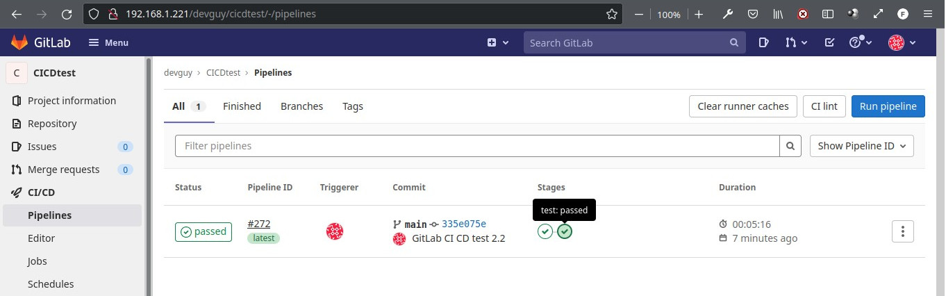
VI. Test it
deplo
After 18 minutes you can open a browser at:
Try adding some ‘guestbook’ entries by typing in a message, then click the ‘Submit’ button. The message you typed is send and stored in the Redis database and then is read from the Redis replicas and listed at the bottom.

VII. SCALE
Scale the Web Frontend
You can scale up or down as needed because your servers are defined as a microservice.
- Run the following command to scale up the number of frontend Pods:
$ kr scale deployment frontend –replicas=5 - Query the list of Pods to verify the number of frontend Pods running:
$ kr get pods
VIII. Clean Up
To manually delete the Kubernetes objects we deployed for the App then:
$ cd ~/Desarrollo/ci_cd/Ansible/107_Redis_CICD/guestbook

$ kr delete -f ./files/frontend.yaml
$ kr delete -f ./files/redis-follower.yaml
$ kr delete -f ./files/redis-leader.yaml
$ kr delete namespace testing

$ kr get pods -n testing
Reference
- Build multi-arch docker images on gitlab
- Multi-arch docker images in gitlab
- Building Docker Multi-Arch Images with GitLab CI/CD
- Build docker container for multiple architectures on Gitlab CI
- Multi-arch build, what about GitLab CI? (at docker)
- Stackoverflow: building multiarch images
- Documentation: Buildx at GitHub. docker buildx create at Docker.
- https://docs.docker.com/engine/context/working-with-contexts/
- https://docs.gitlab.com/ee/ci/docker/using_docker_build.html